| Charts are effective way to visualize the aggregated values. This post discuss about creating a chart, Pie and Gauge reports using SQL server 2008 R2 Reporting Services. You will notice a significant difference in chart types in SQL 2008 R2 compared to SQL 2005. |  |
Choosing Chart types: The important point while choosing a report type is – choose a chart type that meets the need and adds business value to the report.
You can choose Linear bar and column charts for visualizing the quantitative points. Line Chart may be the best choice when you measure the time on one axis and data values on another axis. Pie chart is suitable when you want to show portions and ratios.
We can use the same dataset that we used for tabular report for creating chart reports. You can read the post here.
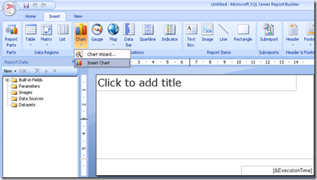
1. Insert a chart from the ribbon, then you will get the following dialogue box
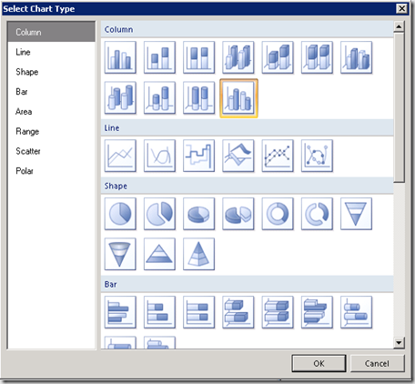
Select the “3D clustered cylinder†chart and say ok.
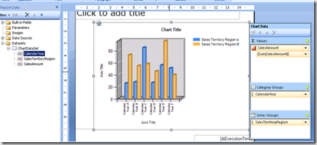
2. After dropping a chart, Drag the data fields from the left in dataset. Drag and drop the Sales amount field into the values group. Drop the SalesTerritoryRegion field to the right in series group. Drop the Calendar year field to the category group.
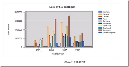
3. Preview the report by clicking run button then you will see the following window
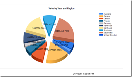
4. Change the report type to Pie(3D – exploded) , select the caledar year field in category group and delete it from the region. you will see the report as shown below
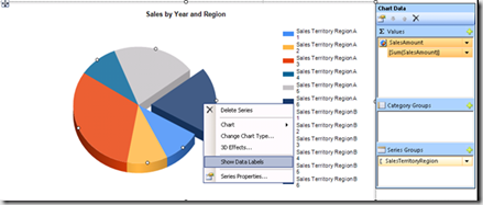
5. To display data point labels over each pie slice – Right click on slice and select show data fields option. To display formatted numbers on each pie then right click on slice and select the option series label properties. After setting these properties, run the report to see the result
Designing the Gauge Reports – Gauge report was added to SQL server 2008 reporting services. There are so many properties to set for Gauge report.
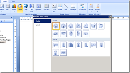
Insert the chart of type Gauge to report designer as follows
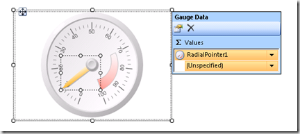
In this example, I am selecting the Radial Gauge.
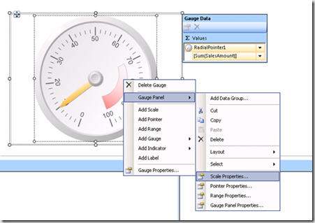
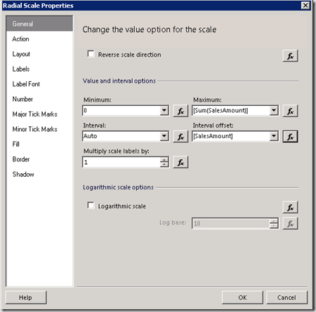
The scale and pointers both have minimum and maximum value properties that can be set to either fixed or variable values. Right click Gauge in report designer and select the scale properties from Gauge Panel
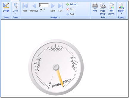
Run the report to preview
| Share this post : |  |
 |
 |
 |
 |
[…] 8. Here I have set up the gauge for the status field and assign the properties which I discussed in my previous post […]