What is Power Map?
Power Map is a data visualization tool for Microsoft Excel 2013 which allows the users to view the information in new ways. The data visualization is on Three Dimensional(3-D) globe. The preview of the tool can be downloaded from here. Three main Power Map features are
Map Data You can easily view more than million rows of data in 3-D and on Bing map from Excel sheet table or the Data Model in Excel.
Insights Visualize the time-stamped data in geographic space over a time period.
Share Stories You can capture screenshots and build guided tours. These guided tours can be exported to video.
Power Map works only with Excel 2013 professional plus, Once you installed Power Map then you can open it from insert tab as shown below
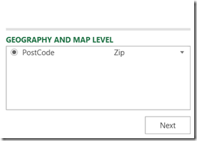
Click the Map button and it then opens a blank globe. Drag and drop the field from your dataset for GEOGRAPHY and MAP LEVEL
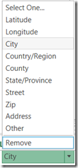
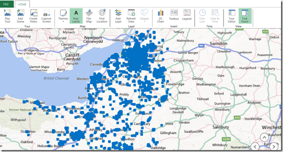
click the drop down if the match is not correct. Dots will appear on globe as Power Map plots the data
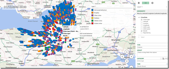
Click next and add a field to the height section and category section. Usually an aggregated value can be dropped to height section. In this example crime type dragged to category and month to Time section.
Prepare the data for visualization to get the better view on Power Map data should be organised in excel work sheet or Data Model that you have created using power pivot.
Adding the data to Power Map To add data to Power Map, select that data in your worksheet and click Add Selected Data to Power Map. You will get the below screen when you click the Map button under insert menu
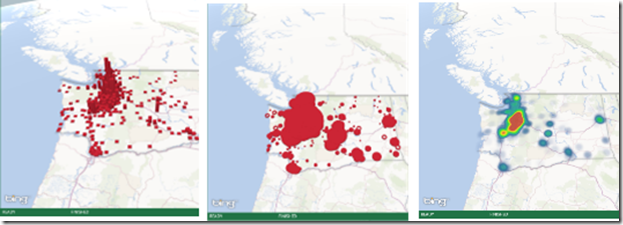
You can visualize the same data in different formats using Layer Manager, you can change the default visualizations from Column to Bubble or Heat map.
Visualizing the data over time
To view the data over time, drag the time field from your dataset to Time box.The Power Map Time player appears at the bottom of the screen and Power Map will process the data over time so that it can be visualized and animated.

