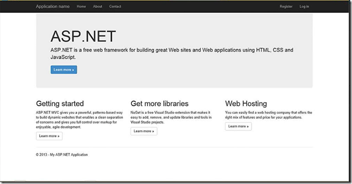
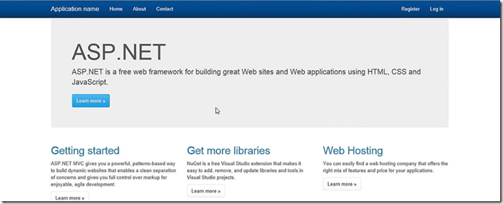
It is critical for the web developers to target their websites to render on different devices and form factors. ASP.NET templates now using a framework called Bootstrap. What is Bootstrap? Bootstrap is front-end framework for easy and faster web development. This post explains how to use Bootstrap in ASP.NET applications and outlines some of the features of this framework. Create a new ASP.NET project in Visual Studio 2013 and execute it then you will see the look and feel of the page as below.
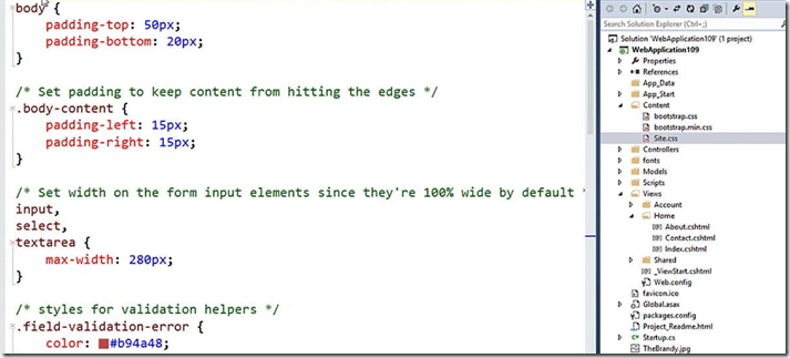
If you want to get the above look without using Bootstrap then you have to write lot of custom CSS. Now all ASP.NET default templates like MVC, Web forms, Single Page applications and Web API are using Bootstrap framework. Bootstrap version 3 is integrated in Visual Studio 2013. The above screen scales well on different devices. If you look at the CSS code to achieve is very few lines as shown below
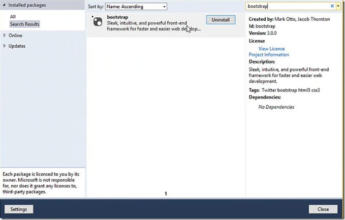
In order to get the Bootstrap into your project, go to Manage NuGet packages window and type Bootstrap in search box then you will find the package
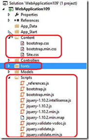
once you install the package then it brings the following files into your project, All the CSS and JavaScript files related Bootstrap framework are bundled for you to get you better performance.
Another integration feature for Bootstrap is Bootswatch, which helps you to theme your site. To apply theme to your site go to Bootswatch site and choose the theme which you like and download and copy the CSS and overwrite the Bootstrap.css in your project. After applying one of the sample free theme then the site looks as below, In matter of seconds you can quickly change the theme of your site.
Bootstrap works with grid layout. The above page is divided into 3 columns of width 4 each and it is very easy to change the layout of the page using CSS
if you want to change the layout of the page just change grid sizing something from value “col-md-4†to “col-md-6â€. Make sure three columns added up to 12.
Another key feature of Bootstrap is dealing with the images, it makes the image experience as responsive without writing any code! just use the class name “img-responsiveâ€.
It adds the responsive behaviour to the image and it make sure to render nicely in your site.
Another common requirement is styling the tables, If you use the class name table it will give you the outline to your table, you can add borders to table with class name table-bordered.
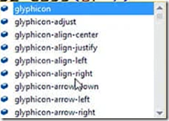
Bootstrap also has a nice feature called Glyph icons, for example if you want to add envelope to your support e-mail address then you can use class name glyphicon-envelope
more on the Bootstrap CSS class names and tutorials can be read from here

nice info…i understand only the css how you are doing…Actually i am a java developer. Thank you.