|
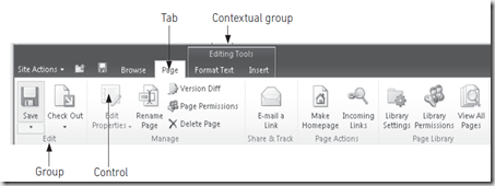
Presentation Layer point of view Ribbon is a big change in SharePoint 2010, which provides the consistent user experience between SharePoint and Microsoft Office products. Ribbon is defined in the form of XML and Javascript is used to provide client side functionality. The client side script is located in the following path %SharePointRootpath%\TEMPLATE\LAYOUTS\CUI.js Configuration of Ribbon is stored in XML file in %SharePointRootPath%\TEMPLATE\GLOBAL\XML\CMDUI.XML. |
Extending the Ribbon
You can add the controls to Ribbon either declaratively using an element file or programmatically add controls using custom code. Adding the custom Tab declaratively
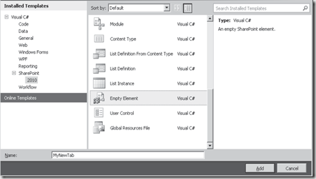
1. In Visual Studio Choose Project –> Add new item then select Empty Element from the Add New Item Dialogue as shown below
2. Add the following code to the Element.xml file in the MyNewTab folder
1: <?xml version="1.0" encoding="utf-8"?>
2: <Elements xmlns="http://schemas.microsoft.com/sharepoint/">
3: <CustomAction Id="CustomTab" Location="CommandUI.Ribbon"
4: RegistrationType="List" RegistrationId="101">
5: </CustomAction>
6: </Elements>
1: <CommandUIExtension>
2: <CommandUIDefinitions>
3: <CommandUIDefinition Location="Ribbon.Tabs._children">
4: <Tab Id="CustomTab" Title="MyCustomTab"
5: Description="Tab for demo" Sequence="501">
6: </Tab>
7: </CommandUIDefinition>
8: </CommandUIDefinitions>
9: </CommandUIExtension>
The above code creates a new Tab element to the Ribbon, Set the value Ribbon.Tabs._children to Location when you want to add tab to existing group. Use Ribbon.ListItem.New.Controls._children to add a control to the new group in the tab.
4. Add the following code under Tab element
1: <Scaling Id="CustomTab.Scaling">
2: <MaxSize Id="DemoGroup.MaxSize"
3: GroupId="DemoGroup"
4: Size="OneLarge"/>
5: <Scale Id="DemoGroup.Scaling.CustomTabScaling"
6: GroupId="DemoGroup"
7: Size="OneMedium" />
8: </Scaling>
9: <Groups Id="CustomGroups">
10: <Group Id="CustomDemoGroup"
11: Description="Contains Demo controls"
12: Title="Demo Group"
13: Sequence="52"
14: Template="Ribbon.Templates.SingleButton">
15: <Controls Id="CustomDemoGroup.Controls">
16: </Controls>
17: </Group>
18: </Groups>
Scaling group contains two main elements MaxSize and Scale. Use MaxSize when there is no spacing constraints. Use Scale element when there is insufficient space for the template.
5. Add the below code in Controls element section as shown below
1: <Button Id="DemoGroup.test"
2: Sequence="15"
3: Image16by16="/_layouts/images/abc.png"
4: Image32by32="/_layouts/images/xyz.png"
5: Description="Displays a test message"
6: LabelText="Test"
7: TemplateAlias="c1"/>
TemplateAlias attribute is used to hook up the control to the templates in the group element.
More about this concept can be read here
| Share this post : |  |
 |
 |
 |
 |

