This post discusses the new features introduced in SharePoint 2013 for Business Intelligence and how you can do the things in better way using SharePoint 2013, PowerPivot and Power View. SharePoint is really about organization, discovery, building out new solutions and managing those solutions. So With Microsoft BI tools how do you explore the data? How do you mine the data? How do you visualise and control that data?
Exploring the Data
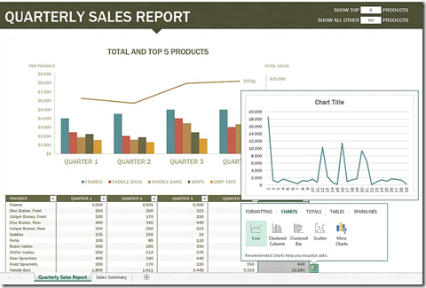
Using the tool Power Pivot in excel you can combine and analyze large data sets and you instantly preview the charts and pivot tables. You can also do the formatting of data, creating relationships and apply date maps to that data.
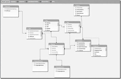
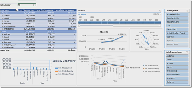
Power Pivot in Excel 2013 allows you take the data model out of the database and extend that with things like hierarchies and key performance indicators (KPI’s) . So once you pull the data into excel Power Pivot then you can slice the data , these slicers are the relationships in your data.
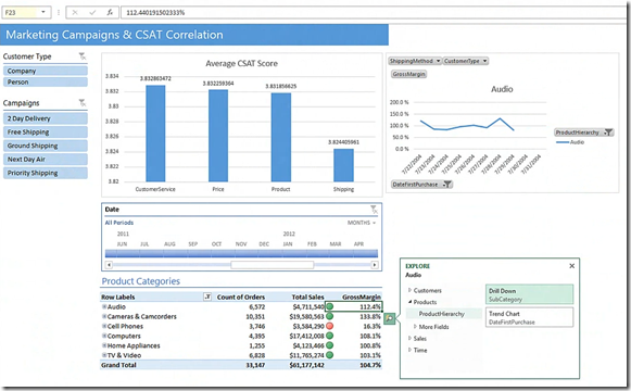
It helps you to explore and navigate your data using trend lines and time lines and drill-down those data.
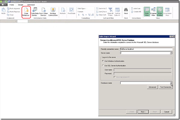
Power Pivot can even work with billions of lines data in excel. To demonstrate this connect to SQL Server and pull the data into excel, Download the Power Pivot add-in to do the below steps from here. Click on From Databases in ribbon as shown below
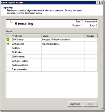
Enter the database server name and pull the database into excel workbook, What it does is it caches all the data using an ETL tool when you select the tables from database.
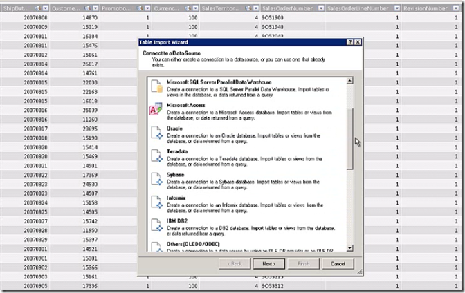
Once you import the data into excel then you can extract that data into a Visual Studio solution and can run it from there, You can also take this data and can save it in tabular model in analysis services. It is a new way of looking the data in Analysis Services. You can also add and delete the columns from this data. You can even connect this data with other data sources like Oracle and IBM datasets.
You can extend the schema by using DAX language functions, more about this can be read here. All the changes that you make to this data will reflect in your front-end model, once you are happy with the changes to the schema and data then you can create Pivot Tables and Pivot Charts. Now it is easy to create a chart or pivot table just drag and drop the fields. Now you can publish this data to excel services in SharePoint.
Visualize the Data
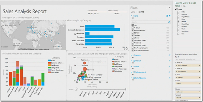
Power View is the new tool which you can use to perform an interactive data exploration and it allows you to share reports with your colleagues. In this case it can take the data from the work book that you have created above and it can take the data from Power Pivot datasource. It is a very powerful tool and easy to use and it leverages to use the data model that you have created in excel.
You can create bar charts, bubble charts that have three or four dimensions and you can fine-tune your reports with chart and view filters. Once you publish your Power Pivot workbook to SharePoint, You can still see the slicers, powerful visualizations. You can interact with the workbook with all of the rich features of the Excel Client in the browser.
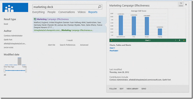
Once you publish all the Power Pivot workbooks to SharePoint and you can share them to colleagues. Every one which you have shared the report either they can edit or have read-only view based on the permissions you set in SharePoint, You can then have (SharePoint 2013 feature) quick preview of the reports without actually opening them as shown below
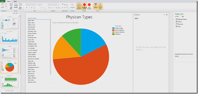
Interactive data exploration with Power View is very useful feature in SharePoint 2012 as shown below
You can have read mode, edit mode and full-screen mode of the report.
| Share this post : |  |
 |
 |
 |
 |

