| Power View is a new feature available in SQL Server 2012 reporting services, It is a browser based application which requires Reporting Services to run in SharePoint Integration mode. The datasource for Power View application is either a analysis services CUBE or Power Pivot work book that needs to deploy to SharePoint document library. This post explains about creating a Power View Report in SQL Server 2012. |  |
Creating a Power View Report
You can use the following data source to create a Power View Report
Shared Data Source Create a Reporting Shared Data Source (RSDS) file and set the Datasource Type property to Microsoft BI Semantic Model for Power View and define the connection string that refers to the Analysis Services model.
PowerPivot workbook Select a PowerPivot workbook from PowerPivot Gallery as a source for Power View Report.
To create a new Power View report, use one of the following options
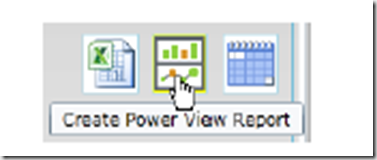
1. Click the PowerPivot workbook in the PowerPivot Gallery, then click the create Power View Report icon as shown below
2. You can also create a Power View report from data connection library file with extension BISM(Business Intelligence Semantic Model) by clicking the down arrow next to the file
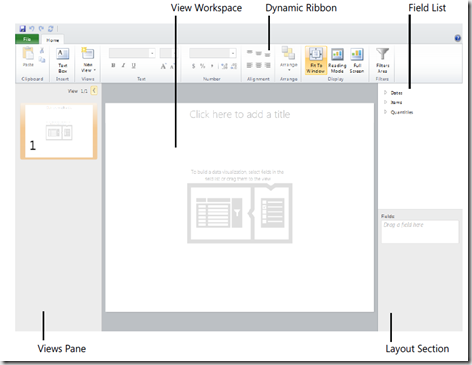
A blank view workspace will be created when you create a new report in Power View design environment. You can then add tables and data visualizations to the view workspace.
The Power View Design environment looks as below
when you add fields to the report then design and layout tabs will appear , the content of each tab changes dynamically to show you only the applicable buttons to the selected item.
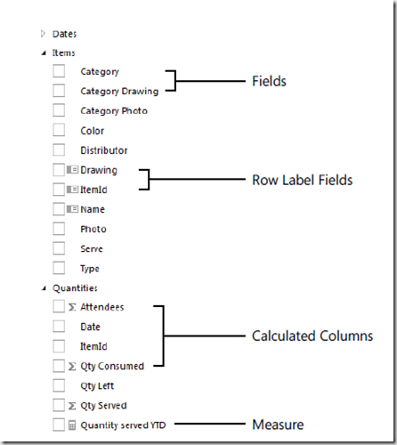
The field list from the analysis services model will appear in the upper-right corner, expand the field-list then you will see the view as below
Click a field to add it to the view as a single column table, Power View formats the field according to data type.
The content of the layout section change according to the current visualization, you can use layout section to arrange the sequence of fields. When you complete the design then you can save using File menu and you should have Add items permissions on destination folder, the report saves as RDLX file
Data Visualization
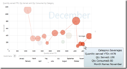
You can explore the data in several views in Power View like in the form table then you can convert it to matrix, chart. If you convert the table view to scatter chart, you can add a play axis to visualise the changes in chart.
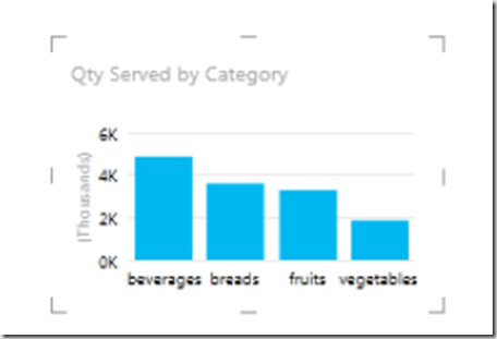
Charts when you add measure to table, the design tab includes icons for chart visualizations such as column, bar, line and scatter chart.
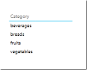
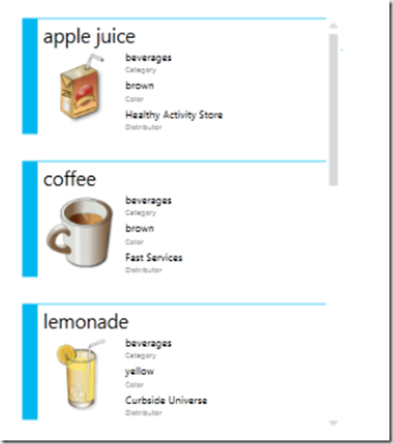
Cards and Tiles Card is another type of visualization, which is a scrollable list of grouped fields arranged in card format as shown below
You can change the sequence of fields by re-arranging them in layout section
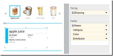
The default layout of the tiles is tab-strip mode, You can toggle between tab-strip mode and cover-flow mode by using respective button in the Tile Visualizations
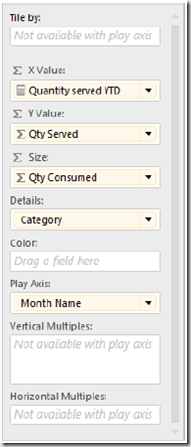
Play Axis – If your table or chart contains two measures then you can convert it to a scatter chart to show one measure on horizontal axis and second measure on vertical axis. Another option is to use third measure to represent size in bubble chart that you can define in layout section.
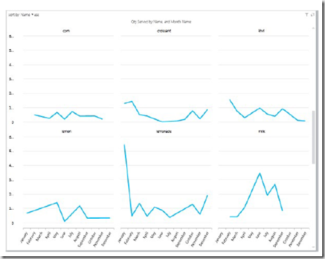
Multiples – Another way of visualizing the data is to break a chart into multiple copies of the same chart. Place the field which you want to create separate charts in Vertical Multiples then use the grid button to select the number tiles across
A very useful Power View feature is the ability to export your report to PowerPoint.
| Share this post : |  |
 |
 |
 |
